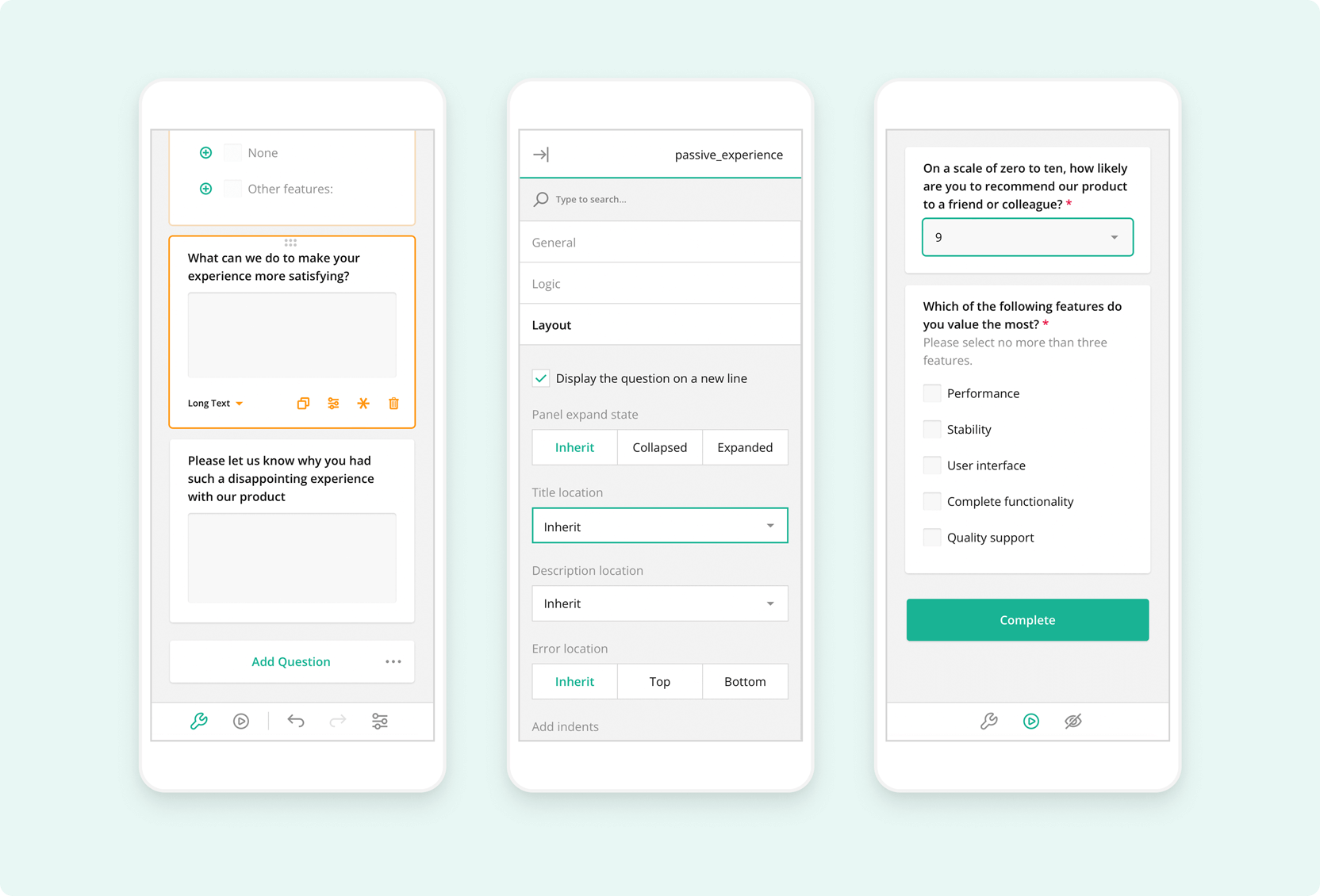
Introducing built-in side navigation (TOC), Image Capture in File Upload, Vue 3 Support for Form Library, Theme Editor in Survey Creator, and more!
The All-New Theme Editor: designing your survey's identity is now easier than ever
We are happy to finally unveil a game-changing addition to SurveyJS Creator - the Theme Editor. You now have the power to effortlessly build and customize survey UI themes to create unique survey looks tailored to your application.
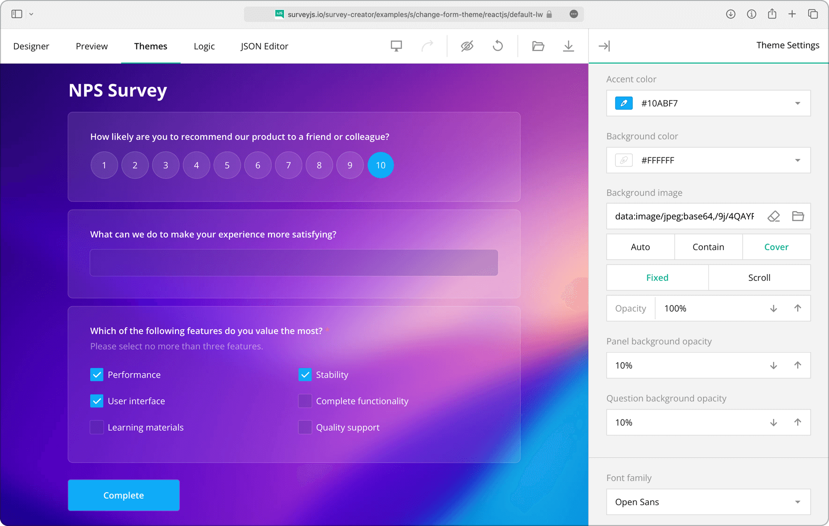
SurveyJS themes rely on CSS variables to define colors, fonts, sizes, and more. The Theme Editor lets you set those CSS variables with a panel of UI controls - turning theme customization into a user-friendly experience. Once you have finished customization, simply download an automatically generated JSON object packed with CSS variables and other theme settings, and store it on your server to then apply it to your survey or form whenever needed.
And here's the exciting part: we've included a collection of predefined themes to help you get started. Just pick a theme as your base, refine it further to align with your brand's aesthetic, and witness real-time changes - from colors to layouts. Notably, our predefined themes prioritize accessibility. Dark mode and a specially designed contrast theme are particularly suited for individuals with visual impairments.
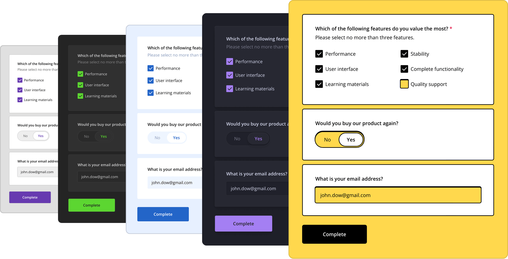
You can try out the Theme Editor online in a dedicated tab of our all-in-one demo or access it as a part of Survey Creator integrated in your application.
Wondering how to apply a new theme to your survey? Our Form Library documentation has you covered with a step-by-step guide on creating a custom theme. Please also refer to the collection of demos specially designed for various real-life use cases. The demos showcase the limitless customization capabilities of SurveyJS Creator and the Theme Editor in particular and all come with ready-to-use code examples for all popular JavaScript platforms.
Introducing Built-in Side Navigation (TOC) in our Survey Creator
We are thrilled to announce the latest addition to our feature lineup: the built-in Table of Contents (TOC), which makes form navigation even easier and more intuitive.
Why is a Table of Contents such a valuable feature? In any enterprise-grade form builder, having a clear and organized structure is crucial for an optimal user experience. The TOC acts as a roadmap, allowing respondents to easily track their progress and jump between sections, pages, or questions. It streamlines the form-filling process and ensures a seamless and efficient user journey.
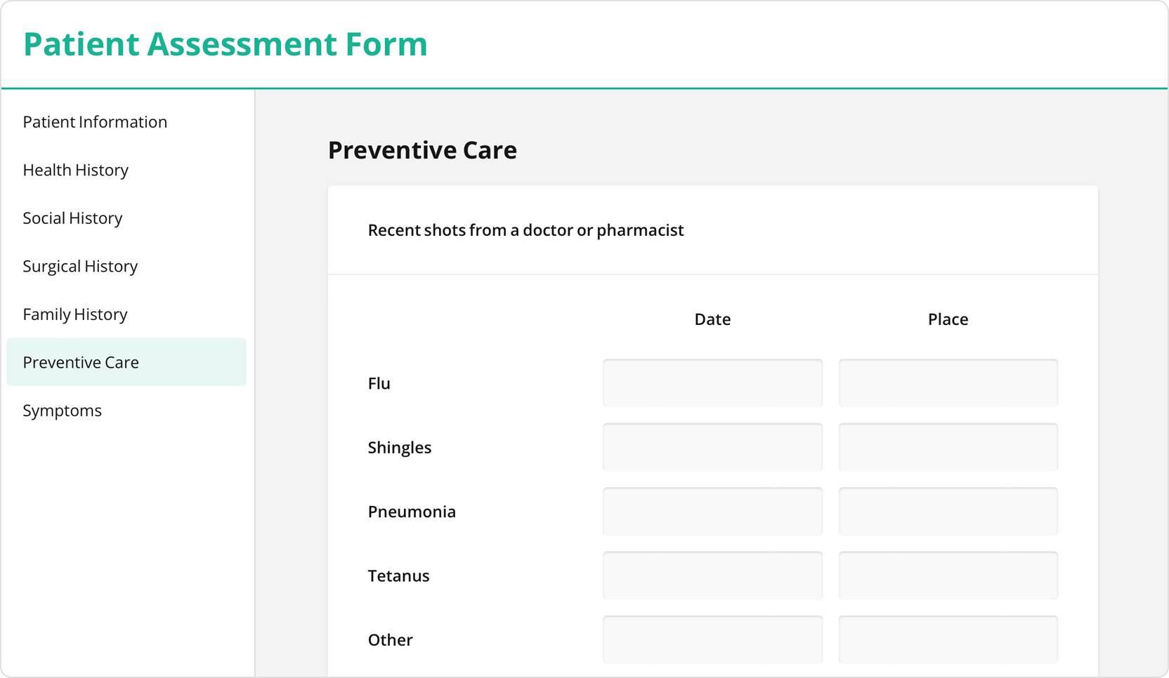
Enabling the TOC in your forms is a breeze! By simply setting the showTOC property to either true or false, you can effortlessly add or remove the TOC navigation. We've designed it to be user-friendly and highly customizable, allowing you to tailor the TOC to your specific needs. For example, you can easily reposition it, assign custom titles to each TOC element, and decide whether to use page, section, or question titles as TOC tabs that respondents can switch between.
Ready to try out the side navigation (TOC) in your forms? Please refer to our free side navigation demo to see it in action with ready-to-use code examples for all popular JavaScript platforms.
File Upload: Gallery Preview Mode
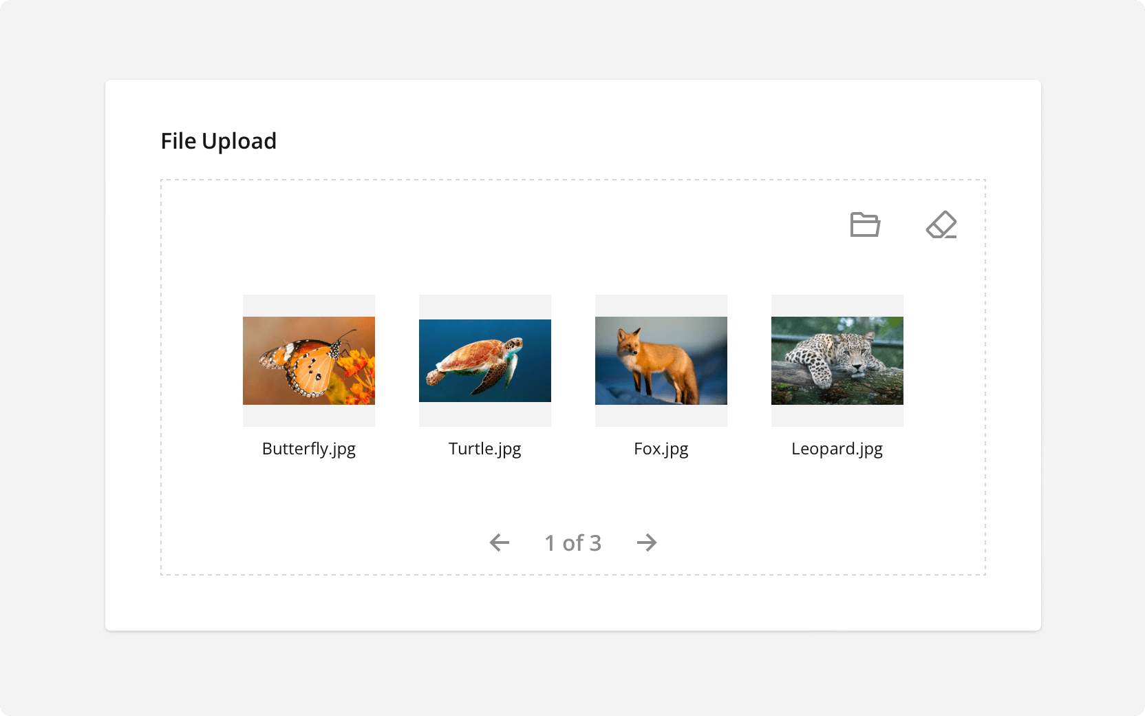
The File Upload question enables respondents to easily upload one or multiple files, and these files will be displayed as thumbnail previews. However, we understand that when dealing with numerous file uploads, it can be challenging to fit them all within the limited width of the question.
For this reason, we've introduced Gallery Preview Mode for the File Upload question. In this mode, file previews are thoughtfully split across multiple pages, ensuring that each page contains as many thumbnails as the question's width allows. To find and manage certain uploaded files, respondents can effortlessly navigate between these pages using navigation icons.
Right-to-Left Language Support in PDF Documents
PDF Generator now has full support for right-to-left (RTL) languages in generated PDF forms. If your survey or form contains RTL content, enable the isRTL property in document options.
Introducing Image Capture for Effortless File Uploads
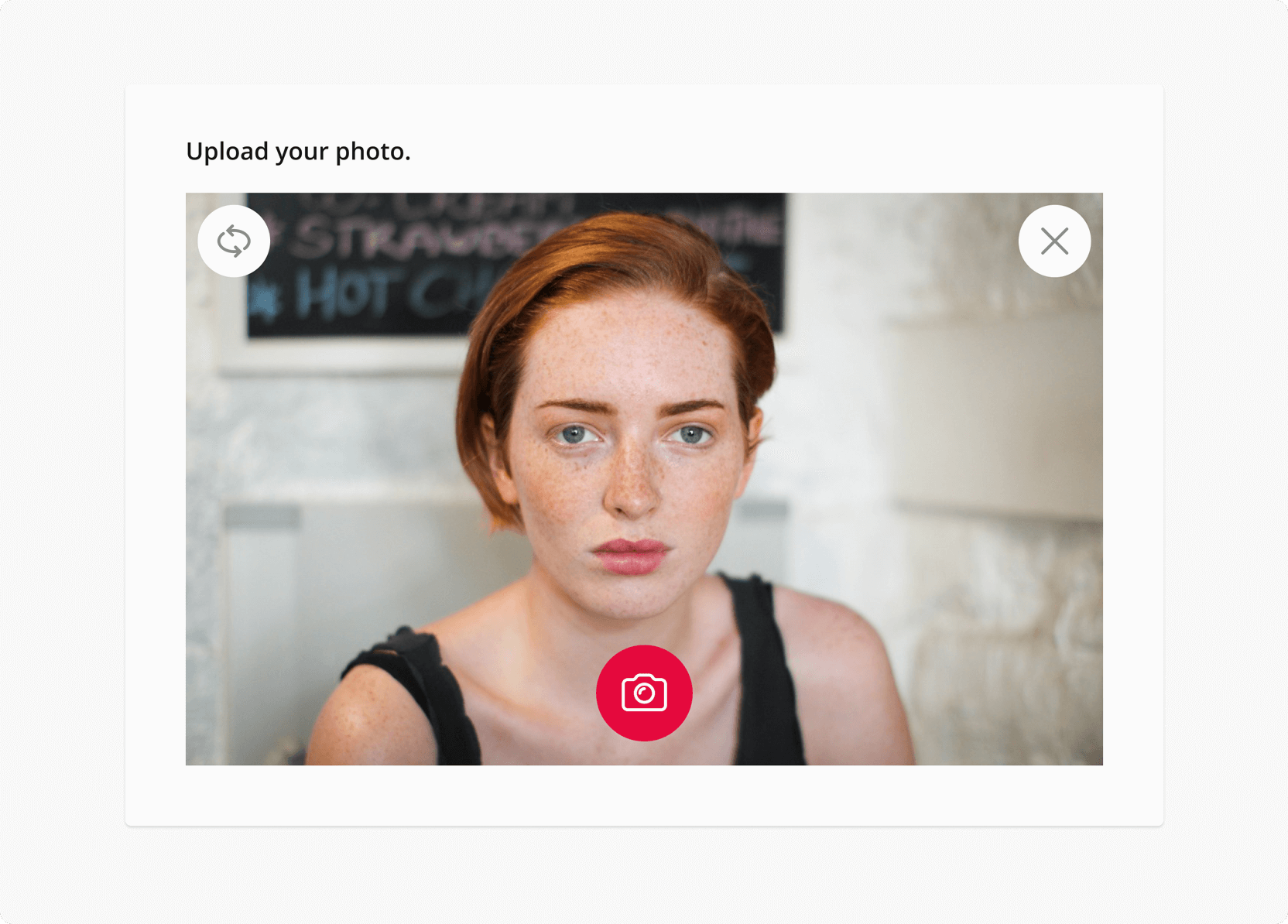
Uploading files from a local device is a standard practice, yet it's not always convenient: users must go through the process of taking a picture separately and then uploading it, which often requires additional steps and software.
If you require respondents to upload images within a form, you now have the option to enable the Image Capture. This feature allows users to capture, upload, and preview multiple photos directly within the form without the need to leave it. Additionally, if a user already has a pre-captured photo, you can easily switch to the "Local files or camera" option. This configuration enables respondents to either browse and upload a pre-captured file from their computer or capture it directly within the form.
Form Library and Survey Creator powered by native Vue 3 rendering
This year, we've taken a step forward in aligning our Survey Creator and Form Library with Vue 3's capabilities. Each component includes the same rich feature set as versions for other frameworks while being entirely rendered using the native Vue 3 rendering mechanism. This approach liminates the need for wrapping and reduces code redundancy in your applicatiton. Without unnecessary code duplications, the development process becomes cleaner and more straightforward, enhancing overall efficiency and providing a smoother, more integrated experience. We're excited for all Vue 3 followers to experience native rendering firsthand.
Every Survey Creator and Form Library demo now features a dedicated tab with code examples written in pure Vue 3. To explore and experiment with our demos, open the Code tab in any demo and select Vue 3 among the available frameworks.
Ranking: Select Items to Rank
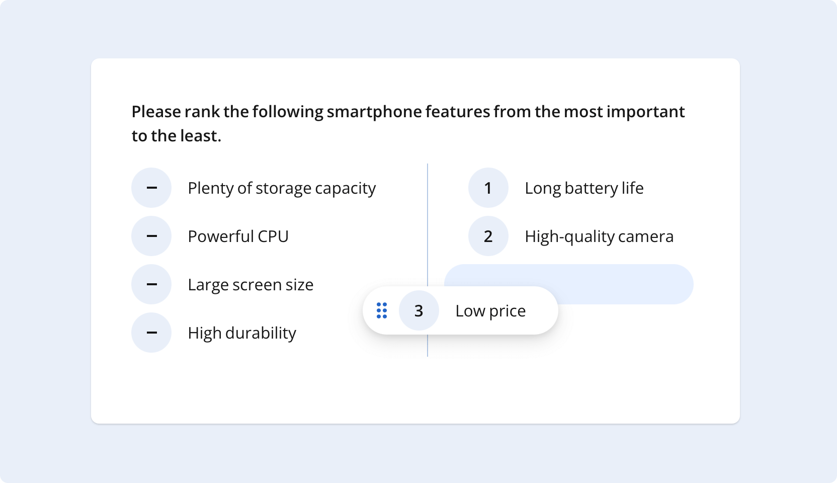
We've introduced a significant improvement to the Ranking question, offering both survey creators and respondents greater flexibility. Respondents can now cherry-pick the items they wish to rank, drag them from the unranked area to the ranked area, and easily reorder items to assign different ranks, leaving the remaining items unranked. Additionally, survey creators have the option to display the ranked and unranked sections either side by side or in a vertical layout and to set a limit on the maximum number of ranked items using the maxSelectedChoices property.
Machine-translated UI texts
We've expanded our language support to over 50 languages with machine-translated UI texts. While most translations are community-driven, any remaining strings are now filled with accurate machine translations generated by Azure AI Translator by Microsoft.
New Rating Scale Types: Stars and Smiley Faces
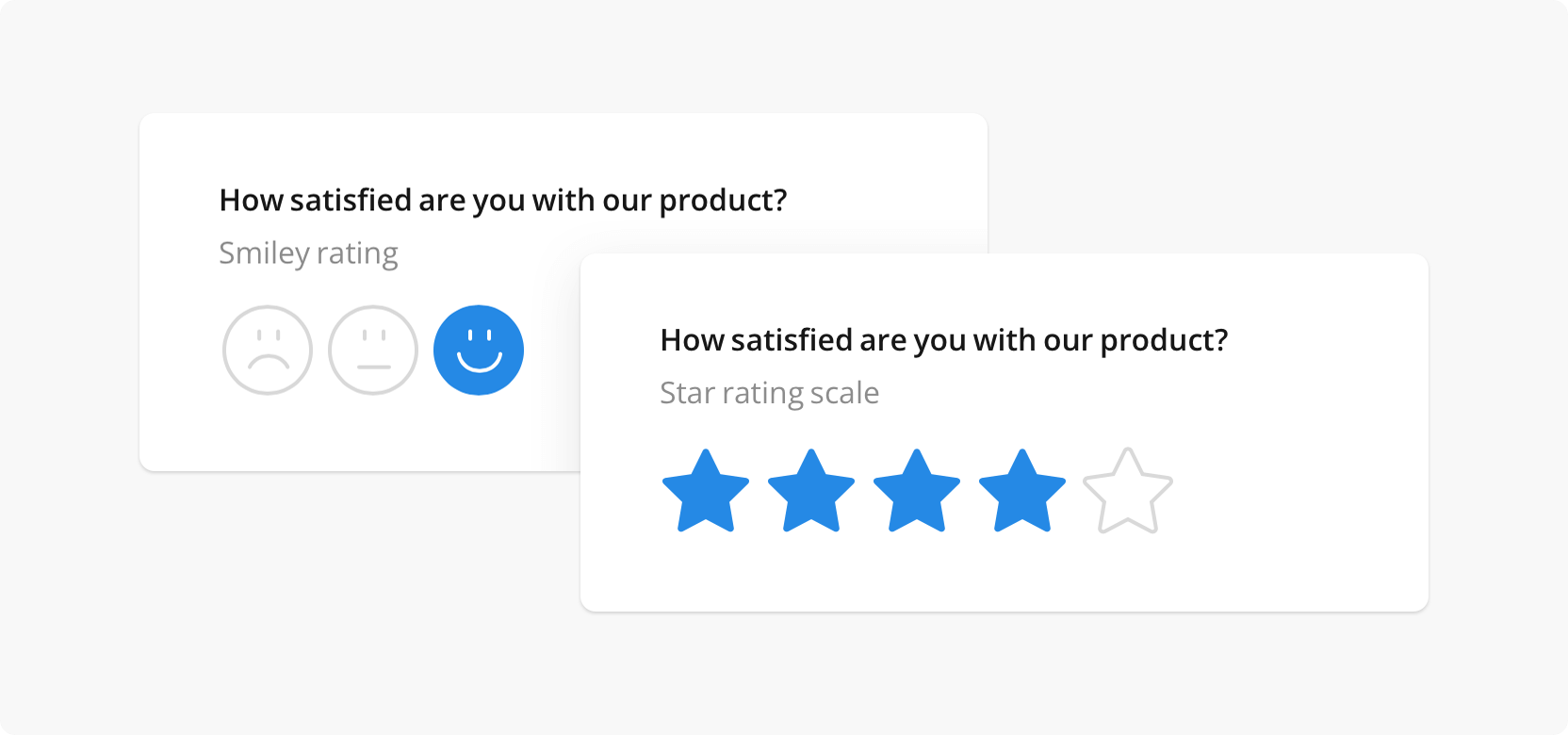
Our Rating Scale question type introduces two new scale types: stars and smileys. A star rating scale offers respondents a series of stars to rate your service or product. A smiley face rating scale uses two to ten emojis to help your customers convey their feelings about your product.
Introducing Adaptable Tab View for Dynamic Panels
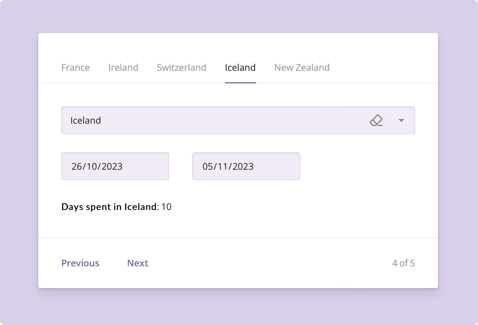
Each panel can now be displayed under a tab to enable users to quickly switch between panels. In addition, the new tab view offers enhanced adaptability: when the available panel width is limited and can't accommodate all the tabs, the extra tabs are hidden in a convenient three-dot menu. This ensures a user-friendly experience even for devices with narrow screen width.
Enhanced support for mobile devices
In SurveyJS, we are committed to making form creation easy and enjoyable on any device. We also want to ensure that our forms, regardless of their complexity and the types of questions used, do not pose challenges for users accessing and filling them out on mobile devices. Our team has worked hard throughout this year to fulfill both commitments and ensure that our forms adjust their layout, appearance, and functionality to suit different screen sizes, resolutions, and input methods commonly found on smartphones and tablets. We are excited to confirm the implementation of the following mobile adaptivity features:
Responsive design: SurveyJS forms are responsive. This means they dynamically resize, rearrange, and adjust their layout to fit different screen sizes. For example, a radio button group turns into a dropdown menu if all choice options do not fit in a single row.
Touch-Friendly elements: We have made our forms easily navigable and interactive. Buttons, signature pads, input fields, checkboxes, and other input elements are now appropriately sized to fit the screen and spaced for comfortable use on touch-enabled devices.
Creation and previewing: Survey Creator is now mobile-adaptive. It enables users to add and configure form elements, apply styles, and preview the result by switching between dedicated tabs within a UI panel. This allows form creators to immediately see how a new form element will appear and function before making them live or distributing them to users. It's also handy if you need to access a form and make amendments, if any are required.
Optimized user experience: Survey Library focuses on delivering an optimal user experience on mobile devices by considering factors such as font sizes, button sizes, form element spacing, and overall usability. It ensures that users can smoothly navigate, input data, and submit forms using their devices without encountering layout or functionality issues.
