How To Make Your SurveyJS Forms Match Your Design System with Theme Adapters for Bootstrap, MUI, and shadcn
Say your product has a mature design system. Tokens for color, typography, radius, spacing, elevation—and everything follows them consistently. But what about your forms? The button radius is slightly off. The focus ring is a different blue. It approximately matches your product, but it doesn't belong to it.
Every time you embed someone else's UI, you inherit their opinions along with their functionality. Most of the time that's a trade worth making. A payment widget doesn't need to look like the rest of your app, after all, and a chat bubble in the corner is expected to look slightly foreign. But forms are the case where this trade stops being worth it.
A form doesn't read as a "widget" to the person filling it out. It is the product—it's onboarding, it's checkout, it's the thing standing between them and whatever they came to do. And on the dev side, a form is the single most control-heavy surface you'll ship: radio groups, checkboxes, dropdowns, date pickers, validation messages, disabled states, focus states, dozens of small visual decisions. Those decisions should come from your design system, not from whoever built the renderer.
To make a form truly match your design system, you need a renderer that runs inside your own bundle and exposes a documented theming contract you can map your tokens onto.
SurveyJS is a form library built around not making you do that work by hand. One shared design-token system runs across its whole product family, with built-in themes that can be applied to any integrated SurveyJS component, and there are prebuilt theme adapters for Bootstrap, Material UI, and shadcn/ui.
This article explains how each approach works, and when to choose it.
Why Don't Embedded Forms Match My Design System?
Embedded forms don't match because your CSS custom properties can't cross an embed boundary. A hosted form, an iframe, any generic UI ships with someone else's defaults and abstractions, and the customization options you're handed operate inside their styling model, not yours.
Sure, you can chip away at this gap with CSS overrides, but it's a losing game long-term. Selectors are going to shift, interaction states will get missed, and every fix will become one more exception your team maintains without ever owning what it's patching.
| Hosted / embedded form | Self-hosted, owned renderer | SurveyJS Form Library | |
|---|---|---|---|
| Who renders the UI | A vendor renderer — hosted page or iframe | A component you install and mount | A component you install and mount, from a JSON schema |
| Who controls look & feel | The vendor, within whatever it exposes | You, through the renderer's theming API | You, through --sjs2-* design tokens and applyTheme() |
| Where your tokens reach | Up to the embed boundary, and no further | Straight through, via an explicit theme layer | Straight through, via a documented token contract |
| Integration surface | Embed URL, params, light theme controls | Framework component, stylesheet, theme config | Framework component, adapter stylesheet, theme object |
| Framework alignment | None | Whatever you build yourself | Prebuilt adapters for Bootstrap, MUI, and shadcn/ui |
You can't engineer your way out of the fact that your app's CSS custom properties don't cross into a third-party iframe, full stop.
Sure, own the renderer and that hard boundary goes away. But it doesn't make the theming automatic. Your tokens and the renderer's tokens still need an explicit mapping between them.
What you get instead is that the mapping lives in your codebase as a real, versioned thing, rather than a pile of unsupported overrides pointed at somebody else's remote UI.
A real production form isn't a text field and a submit button. It's Radio Button Groups, Checkboxes, Dropdowns, Date Pickers, Tag Boxes, matrices, sliders, validation messages, progress bars, and nested panels, each with default, hovered, pressed, focused, disabled, read-only, and invalid states.
Matching your design system means matching all of that, not just whatever happens to be visible in the first screenshot.
How Does SurveyJS Solve The Form Design Problem?
SurveyJS is a family of schema-driven products that share one design-token system.
- The free, open-source Form Library renders and collects responses from a JSON definition.
- Survey Creator is the white-label visual builder on top of that same schema.
- Dashboard turns responses into charts and tables, and...
- PDF Generator produces branded PDF exports.
The Form Library renders inside your application, so your design tokens can reach the form instead of stopping at an iframe. That solves the boundary problem.
But ownership alone isn't the solution. The important part is that SurveyJS exposes a theming contract between your design system and its renderer. That is what changes the unit of work.
Instead of styling every radio button, dropdown, matrix cell, focus ring, and validation message separately, you map your system's decisions onto SurveyJS's semantic --sjs2-* roles. Every component and interaction state that consumes those roles inherits the mapping. You are maintaining one explicit translation layer, not a growing set of selectors coupled to the renderer's markup.
That same vocabulary extends beyond the respondent-facing form. Survey Creator, Dashboard, and PDF Generator read the same --sjs2-* tokens, so shared visual decisions—brand color, surfaces, typography, semantic states—start from one place, while genuinely surface-specific concerns stay explicit, such as Dashboard chart colors or PDF document layout. A brand change becomes a change to the mapping instead of four unrelated redesigns.
Together, the point is not simply that SurveyJS is customizable. It's that SurveyJS gives your design system a controlled path to the rendered pixels, covers the long tail of controls and states through semantic tokens, and hands the rest of the product family the same token vocabulary.
SurveyJS then gives you two ways to create that mapping, based on one practical question: how far has your app actually drifted from a standard framework's defaults?
Path A — Use a Prebuilt SurveyJS Theme Adapter for Bootstrap, MUI, or shadcn/ui
If your app runs Bootstrap, Material UI, or shadcn/ui reasonably close to stock, this is the cheapest path—and it works because SurveyJS already built the translation layer for you.
This translation layer is a theme adapter, a small stylesheet that makes SurveyJS inherit your framework's design language. It connects the variables your framework already publishes to SurveyJS's --sjs2-* roles, so radio groups, dropdowns, validation messages, and focus states pick up the same decisions your app already makes:
| Framework | Framework variables the SurveyJS adapter reads |
|---|---|
| Bootstrap | --bs-primary, --bs-body-bg, --bs-body-color, --bs-border-color, --bs-border-radius, --bs-form-invalid-color, --bs-danger-rgb |
| Material UI | --mui-palette-primary-main, --mui-palette-primary-dark, --mui-palette-primary-contrastText, --mui-palette-text-primary, --mui-palette-error-main, --mui-palette-background-default, --mui-palette-background-paper, --mui-palette-divider, --mui-palette-action-hover, --mui-palette-action-disabled, --mui-shape-borderRadius, --mui-shadows-1, --mui-shadows-8 |
| shadcn/ui | --primary, --primary-foreground, --background, --card, --border, --input, --ring, --accent, --radius, plus Tailwind's own --spacing |
Compare that table to your own theme file. If you recognize those variables as the ones your app actually uses, this path will work.
What Do SurveyJS Theme Adapters Do?
Adapters do two things, both CSS-only. First, they remap --sjs2-* onto your framework variables at runtime, on the SurveyJS theme root (.sjs-theme-overrides). Second, they supply original styles for SurveyJS components that your framework has no native equivalent for—a Tag Box, a Matrix, a Rating Scale—since there's no Bootstrap or MUI class to map those onto in the first place.
That second piece matters later: an adapter can "stop being enough" for two different reasons—either your framework's tokens have drifted from what the adapter reads (a mapping problem), or a control was never covered by the framework's design language to begin with (a coverage problem). The fix for each is different, so it's worth knowing which one you're hitting.
The supplemental styles just ship—there's nothing to configure there. The variable-remapping half is where setup actually matters, and it only works when three conditions are true:
- Framework tokens are actually present on the page before SurveyJS renders.
- So Bootstrap needs
--bs-* from Bootstrap 5.3+ (or Bootswatch). - MUI needs its CSS vars from
createTheme({ cssVariables: … }). - shadcn needs its semantic tokens on
:root/.dark.
- So Bootstrap needs
- Load order runs bottom-to-top: framework theme CSS →
survey-core.css→ the matching adapter → any app overrides. The adapter declares its overrides on the same root SurveyJS uses, so if it loads before the base sheet, those overrides lose. - App-specific decisions go in an optional override stylesheet loaded after the adapter—so those rules win by source order. All SurveyJS adapters (MUI, Bootstrap, shadcn/ui) can reproduce framework controls; but they cannot infer layout and components your team added on top, like header padding, question gaps, or a custom stepper. Prefer
--sjs2-*token overrides on.sjs-theme-overrideswhen possible, and use SurveyJS class selectors (.sd-*) only when tokens are not enough. Keep shared rules in one file and put theme-, palette-, or style-specific tweaks in separate files.
For all SurveyJS adapters—if a framework hard-codes a value instead of publishing it as a variable, the adapter mirrors the stock value.
How Do I Use the SurveyJS Bootstrap Adapter?
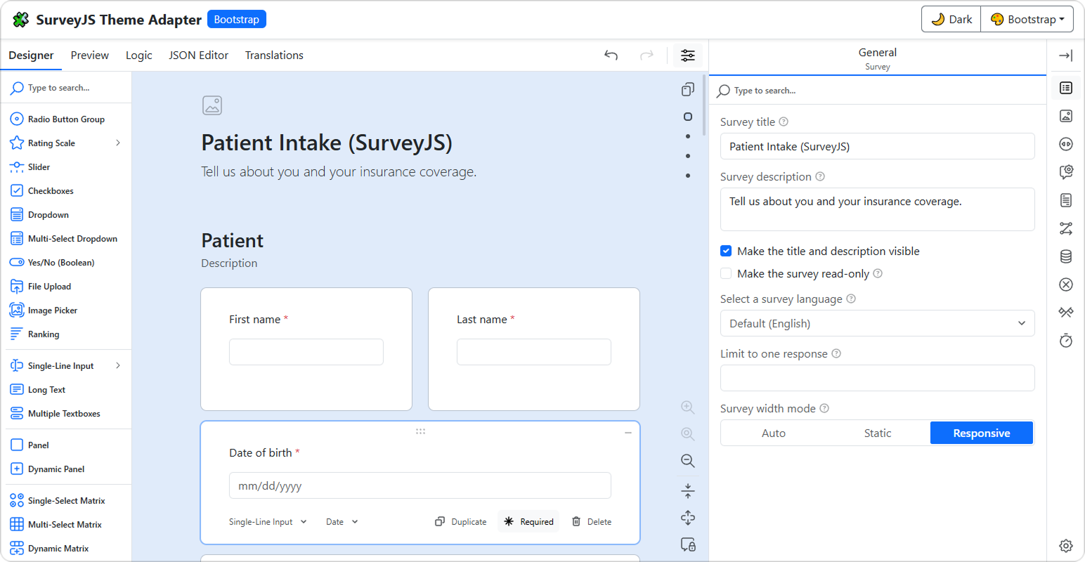
SurveyJS ships one adapter file per Bootstrap build, and you import exactly one of them after survey-core.css: bootstrap-default.css for stock Bootstrap, or the matching Bootswatch file—bootstrap-cosmo.css, bootstrap-darkly.css, bootstrap-flatly.css, bootstrap-litera.css, bootstrap-lux.css, bootstrap-morph.css, or bootstrap-zephyr.css. Each built file already embeds the shared Bootstrap-to-SurveyJS base mapping, so it fits any app that still speaks Bootstrap's --bs-* contract.
Each file only reproduces how stock Bootstrap components look—the values Bootstrap itself compiles into .btn, .form-control, .form-check, .table, and .card, expressed through the live --bs-* variables. Anything that imitates markup your app defines rather than Bootstrap—utility classes such as .lead, hand-built widgets, container padding—is deliberately out of scope and belongs in your own stylesheet.
import "survey-core/survey-core.css";
import "survey-core/themes/adapters/bootstrap-default.css";
Load Bootstrap 5.3+ (or a Bootswatch build) so --bs-body-bg, --bs-primary, and --bs-border-radius exist as CSS custom properties on the document.
The SurveyJS Bootstrap adapter matches Bootstrap controls, but it cannot reproduce choices your app makes with Bootstrap. If, for example, your survey description should look like Bootstrap's optional .lead utility, or your wizard uses a custom stepper Bootstrap does not ship, the adapter has nothing stock to map. Create a small CSS file for those cases, set the tokens on .sjs-theme-overrides, and import it after the adapter:
/* survey-bootstrap-overrides.css */
.sjs-theme-overrides {
  --sjs2-typography-font-size-component-survey-header-description: 1.25rem;
  --sjs2-typography-font-weight-component-survey-header-description: 300;
  --sjs2-layout-component-page-content-area-gap-vertical: 1rem;
}
And then:
import "survey-core/survey-core.css";
import "survey-core/themes/adapters/bootstrap-default.css";
import "./survey-bootstrap-overrides.css";
Put one-theme exceptions in separate files—for example, only a Bootswatch skin that restyles .lead needs its own description-color token.
How Do I Use the SurveyJS Material UI (MUI) Adapter?
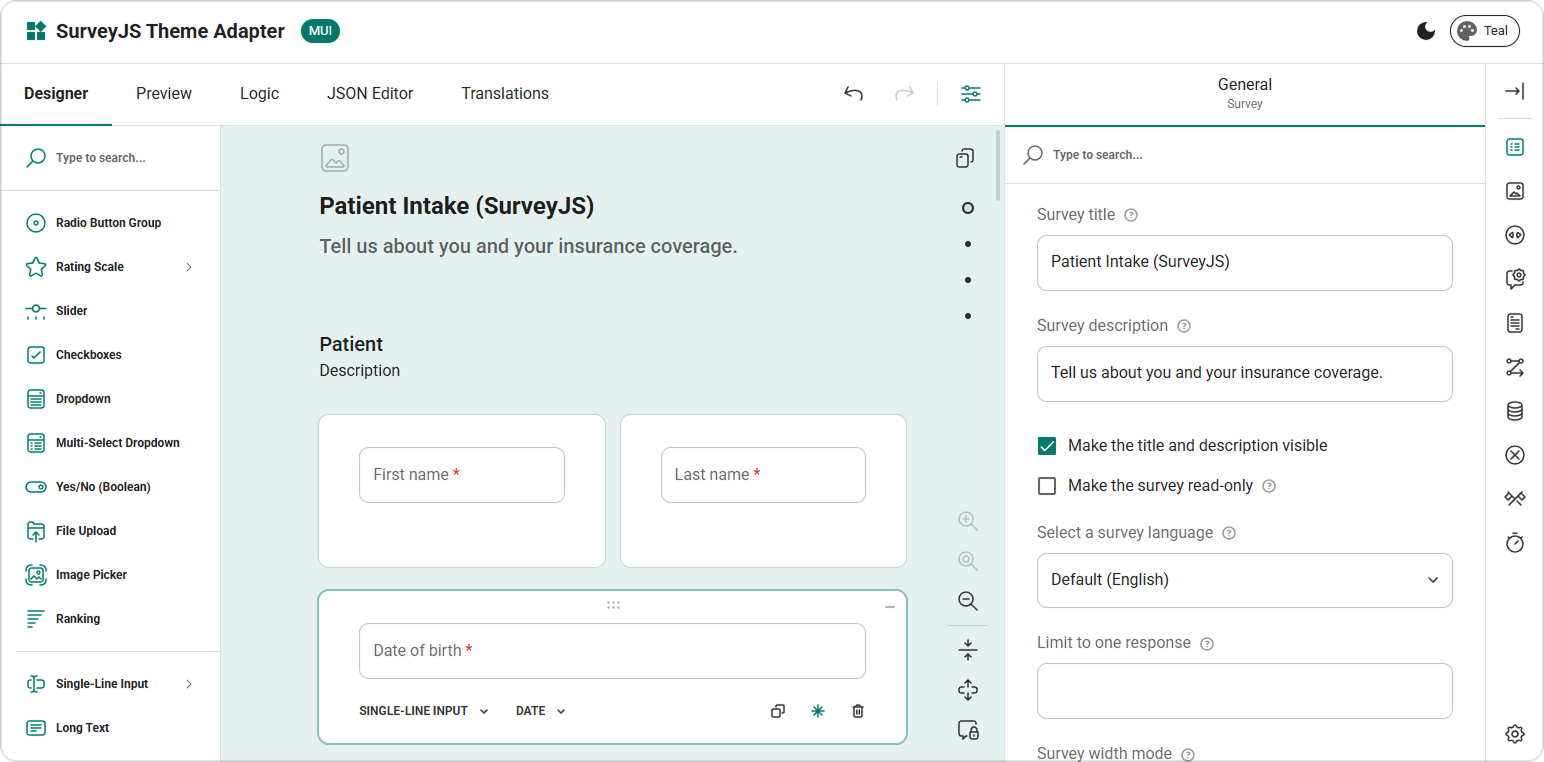
SurveyJS ships a single Material UI adapter, mui.css, and it only works if MUI's CSS theme variables are enabled. Once they are, palette and light/dark changes retarget it for free, because the adapter only ever reads --mui-* tokens.
import "survey-core/survey-core.css";
import "survey-core/themes/adapters/mui.css";
Build the MUI theme with createTheme({ cssVariables: … }). Without that flag, --mui-palette-*, --mui-shape-*, and --mui-shadows-* never reach the document:
import { createTheme } from "@mui/material/styles";

export const theme = createTheme({
  cssVariables: { colorSchemeSelector: "class" },
  colorSchemes: {
    light: true,
    dark: true,
  },
  shape: { borderRadius: 10 },
});
Wrap the tree in MUI's ThemeProvider and import mui.css after survey-core.css.
The MUI adapter maps palette, shape, and elevation but it cannot read layout from your component tree or sx props. If, for example, the rest of your app spaces fields with Box p: 2 and Stack spacing={3}, and stacks columns below the sm breakpoint, SurveyJS will not pick that up from the adapter alone. Map those decisions in an override stylesheet imported after mui.css. For example:
/* survey-mui-overrides.css */
.sjs-theme-overrides {
  --sjs2-typography-font-size-component-survey-header-description: 1.25rem;
  --sjs2-typography-font-weight-component-survey-header-description: 300;
  --sjs2-layout-component-page-content-area-gap-vertical: 1rem;
}
And then:
import "survey-core/survey-core.css";
import "survey-core/themes/adapters/mui.css";
import "./survey-mui-overrides.css";
Add rules like these only when the form must match that composition. Leave color and shape to the adapter. Share these layout rules across every palette, and add a palette-specific file only for a real exception.
How Do I Use the SurveyJS shadcn/ui Adapter?
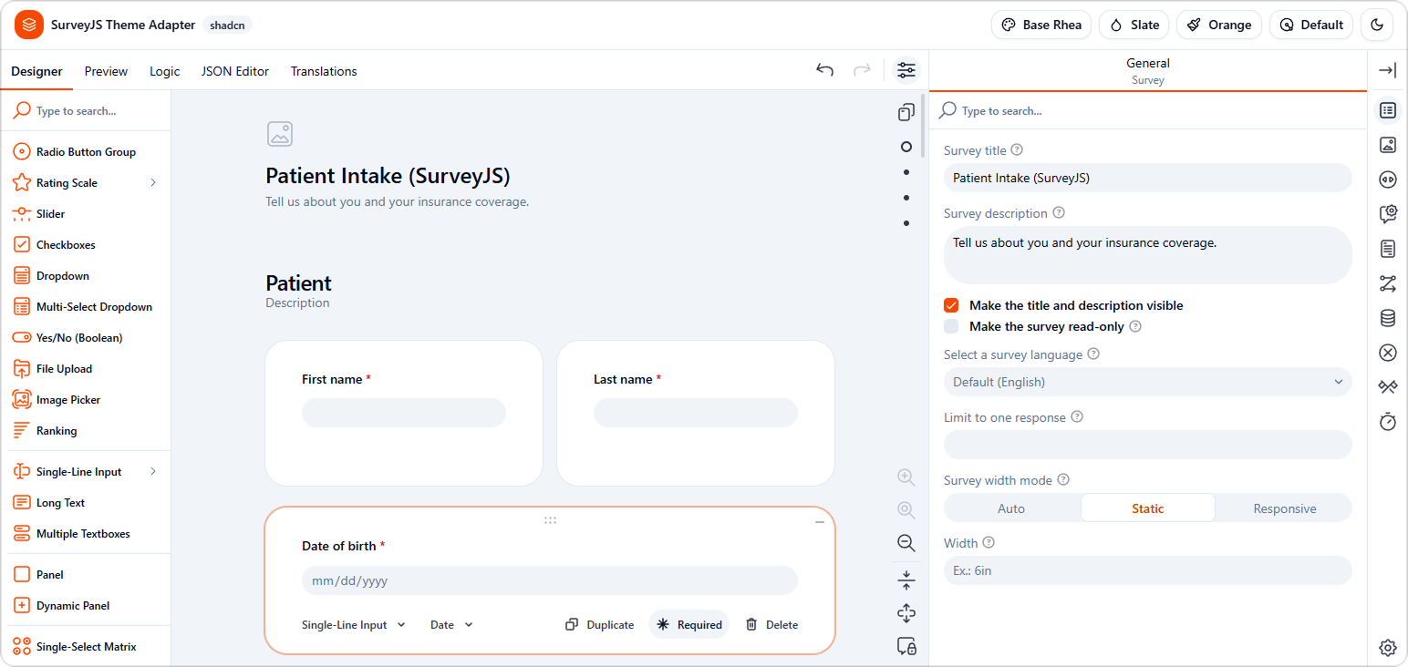
SurveyJS ships one adapter file per shadcn/ui visual style, and you import exactly one of them—not a base plus a delta. shadcn styles differ from each other in more than accent color: control height, radius rhythm, and dark-mode input treatment all shift per visual style. Each built file already embeds the shared shadcn-to-SurveyJS base mapping.
import "survey-core/survey-core.css";
import "survey-core/themes/adapters/shadcn-base-rhea.css";
The SurveyJS adapter for shadcn/ui makes ten variants available: shadcn-default, shadcn-new-york, and eight shadcn-base-* files—luma, lyra, maia, mira, nova, rhea, sera, and vega. Import the one that matches the visual style your app installed (components.json / your ui/ tree), not your accent theme name.
Put shadcn semantic tokens on the document root—--background, --primary, --border, --ring, --radius, --spacing, and the rest—and import that single style file after survey-core.css. A plain Tailwind @theme block does emit its values as :root custom properties, so the adapter can resolve them. @theme inline—what shadcn's generated theme uses—substitutes the values into the utilities Tailwind generates instead, so a token defined only there is never published as a custom property, and the adapter has nothing to read at runtime.
The SurveyJS shadcn/ui adapter matches the selected control style, but it cannot inspect your generated Field wrappers or other app-owned components. If your forms use p-6 padding and gap-4 rows everywhere, put those shared decisions in an override stylesheet imported after the theme adapter:
/* survey-shadcn-overrides.css */
.sjs-theme-overrides {
  --sjs2-layout-component-survey-box-padding-top: calc(var(--spacing) * 6); /* p-6 */
  --sjs2-layout-component-page-content-area-gap-horizontal: calc(var(--spacing) * 4); /* gap-4 */
}
Then import it like:
import "survey-core/survey-core.css";
import "survey-core/themes/adapters/shadcn-base-rhea.css";
import "./survey-shadcn-overrides.css";
If each visual style's Field group uses a different vertical gap—for example gap-4 in one style and gap-6 in another—keep that gap in a separate file per style and import the one that matches the active adapter.
When Does a SurveyJS Theme Adapter Stop Being Enough?
A SurveyJS theme adapter stops being enough for one of two reasons—and they call for different fixes.
The first is drift: your app's look no longer comes from its framework's variables. Until that happens, the adapter is the strongest option available, because the bridge lives in your bundle and resolves against your own variables at runtime. There's no remote theme editor sitting between your tokens and what actually renders—it's just CSS, doing what CSS does.
And because the mapping is written against your framework's variables rather than against fixed values, it survives your own theming. Ship a new palette, flip to dark, add a Bootswatch skin—the form re-skins along with the app, and your override sheet doesn't grow to keep up.
But don't pick this path only because you saw "Bootstrap" in package.json. If your team rewrote the spacing scale, wrapped most of your MUI components, or pushed shadcn's variants somewhere new, the SurveyJS stock adapter is going to faithfully reproduce the framework's look, not yours.
The second reason is coverage, not drift: some SurveyJS controls—Tag boxes, Matrices, Rating Scales—have no native equivalent in Bootstrap, MUI, or shadcn/ui to begin with, so there's nothing for the adapter to remap onto. No amount of token alignment fixes that; it's a gap the framework never filled, and the adapter's own supplemental styles are doing their best guess at your design language, not reading it from your variables.
Either way, that's your cue to move to Path B—whether you're fighting drift or filling a gap the framework never covered.
Path B — Map Your Own Design Tokens With SurveyJS For Total Control
If your system doesn't map cleanly to any framework, or you just want deterministic, hand-authored control, this is the path for you.
You'll only have to code a small adapter object: map your tokens to ITheme.cssVariables once, then call applyTheme() at each mount point. This is distinct from Path A, which is CSS-only—here you're building and applying an actual JS theme object instead of just importing a stylesheet.
Here's the minimal version—no base theme, just the six tokens on top of whatever survey-core.css ships by default (Default Light):
// map-design-tokens.ts
import tokens from "@your-org/design-tokens";

export const surveyTheme = {
  themeName: "app-design-system",
  colorPalette: "light" as const,
  cssVariables: {
    "--sjs2-color-project-brand-600": tokens.color.brand[600],
    "--sjs2-color-fg-basic-primary": tokens.color.text.primary,
    "--sjs2-color-bg-basic-primary": tokens.color.surface.default,
    "--sjs2-color-border-alert-primary": tokens.color.border.danger,
    "--sjs2-radius-form": tokens.radius.md,
    "--sjs2-typography-font-family-text": tokens.typography.fontFamily.base,
  },
};
And then, at each mount point:
// survey-setup.ts
import "survey-core/survey-core.css";
import { Model } from "survey-core";
import { surveyTheme } from "./map-design-tokens";

const survey = new Model(surveyJson);
survey.applyTheme(surveyTheme);
You're not authoring this object from zero, though. SurveyJS applies its Default Light theme automatically the moment you import the core stylesheet, so a minimal cssVariables object like the one above already overrides those six tokens on top of it. That's fine as long as Default Light's own baseline—light mode, panels, standard control sizing—already matches what you want.
The moment it doesn't—you need dark mode, panelless layout, or some other baseline decision Default Light doesn't make—start from whichever predefined theme is closest instead of hand-deriving the difference yourself.
SurveyJS organizes its design tokens into five layers:
| Layer | Name | Example | Should I Override it? |
|---|---|---|---|
| 0 | Palette | --sjs2-palette-gray-900 |
Rarely |
| 1 | Base tokens | --sjs2-base-unit-radius |
Only to rescale the whole UI |
| 2 | System primitives | --sjs2-radius-x100 |
No — these are generated scales |
| 3 | Semantic tokens | --sjs2-radius-form |
Yes — start here |
| 4 | Component tokens | --sjs2-radius-component-formbox |
Yes — for deliberate exceptions |
These layers describe token roles, not a strict one-way chain.
CSS resolves var() references as a graph. Here's a real chain from the default theme, showing how one base unit reaches an individual input field:
--sjs2-base-unit-radius: 8px;
--sjs2-radius-x100: calc(var(--sjs2-base-unit-radius) * 1);
--sjs2-radius-form: var(--sjs2-radius-x100);
--sjs2-radius-component-formbox: var(--sjs2-radius-form);

--sjs2-palette-red-600: #E50A3E;
--sjs2-color-border-alert-primary: var(--sjs2-palette-red-600);
--sjs2-color-component-formbox-invalid-border: var(--sjs2-color-border-alert-primary);
Set --sjs2-radius-form once and every input field, button, and action picks it up. Set --sjs2-radius-component-formbox and only input fields change.
Your mental model is simple: semantic tokens to shift a visual role across the entire interface, component tokens for the deliberate one-off exceptions.
Back to that upgrade path: once you need dark mode, panelless layout, or another Default Light baseline decision, start from the closest predefined theme instead of hand-deriving the difference:
import { FlatDarkPanelless } from "survey-core/themes";

export const surveyThemeDark = {
  themeName: "app-design-system-dark",
  colorPalette: "dark" as const,
  cssVariables: {
    "--sjs2-color-project-brand-600": tokens.color.brand[600],
    "--sjs2-color-fg-basic-primary": tokens.color.text.primary,
    "--sjs2-color-bg-basic-primary": tokens.color.surface.default,
    "--sjs2-color-border-alert-primary": tokens.color.border.danger,
    "--sjs2-radius-form": tokens.radius.md,
    "--sjs2-typography-font-family-text": tokens.typography.fontFamily.base,
  },
};

// The base theme goes in applyTheme()'s second parameter, where it is
// deep-merged under your own tokens:
survey.applyTheme(surveyThemeDark, FlatDarkPanelless);
This gets you dark mode, panelless layout, and every other baseline decision for free, instead of re-deriving them by hand. It also means Theme Editor isn't a separate, disconnected tool from this path—its Export button produces the exact same kind of object, so you can use it to get a reasonable starting point and then hand-edit from there.
SurveyJS derives three more brand shades from --sjs2-color-project-brand-600 by lightness—brand-700 at −15%, brand-800 at −25%, brand-400 at +20%—and those feed brand buttons, selected controls, focus indicators, and progress bars.
Start with brand, foreground, background, radius, and type. Add component-level exceptions only once you hit a real design rule the shared semantics genuinely can't express, and say why in a comment. The same pattern applies whether you're extending surveyTheme or surveyThemeDark—spread the base, override just the token you need:
export const surveyThemeWithExceptions = {
  ...surveyTheme,
  cssVariables: {
    ...surveyTheme.cssVariables,
    // Intake inputs use a pill radius that buttons don't share
    "--sjs2-radius-component-formbox": "var(--sjs2-radius-round)",
  },
};
If you'd rather build the first draft visually, the Theme Editor in Survey Creator exports the same JSON object from UI controls.
The same token mapping then gets reused across the product family, although each surface still has to apply it through its own integration point. Survey Creator uses applyCreatorTheme() for its own chrome and applyTheme() for the form being edited underneath it. Dashboard and PDF Generator accept the shared mapping through applyTheme().
import { Model } from "survey-core";
import { SurveyCreatorModel } from "survey-creator-core";
import { Dashboard } from "survey-analytics";
import { SurveyPDF } from "survey-pdf";
import { FlatDarkPanelless } from "survey-core/themes";

const survey = new Model(surveyJson);
survey.applyTheme(FlatDarkPanelless);

const creator = new SurveyCreatorModel({ /* options */ });
creator.applyCreatorTheme(FlatDarkPanelless); // Survey Creator UI
creator.applyTheme(FlatDarkPanelless);        // form being configured

const dashboard = new Dashboard({ questions, data, /* ... */ });
dashboard.applyTheme(FlatDarkPanelless);

const surveyPdf = new SurveyPDF(surveyJson);
surveyPdf.applyTheme(FlatDarkPanelless);
Two things need a little extra beyond the shared mapping, both for good reasons.
- Dashboard has its own chart palette—
--sjs2-color-data-chart-bg-color-1through-10, plus grid tokens such as--sjs2-color-data-grid-border-axisbecause a ten-series chart palette is a different design decision from a brand color. - And for the PDF module,
applyTheme()covers color- and shadow-related variables only; typography, spacing, borders, and other non-color variables are set separately throughapplyLayout(), starting from the Compact or Spacious preset— because a printed page and a screen were never going to share a layout model.
What's the payoff? When a shared brand decision changes, all you have to do is update the mapping and reapply it at each integration point. Surface-specific decisions—including PDF layout—stay explicit and separate, but the shared tokens will never drift across four integrations nobody's keeping in sync.
Going From "Approximate" To an Actual System
An approximate-looking form is a perfectly fine outcome for some internal tool nobody outside the team ever sees. It's a much harder sell for onboarding, checkout, or intake—the places where the form is the product experience, not a secondary widget bolted onto the side of it.
"How far have I drifted from a framework's defaults?" is the question to ask yourself. Based on that:
| Path | Pick it when | What it costs you | The SurveyJS artifact |
|---|---|---|---|
| A—Prebuilt Theme adapter | You're close to Bootstrap, MUI, or shadcn defaults | One or two CSS imports | A prebuilt stylesheet in survey-core/themes/adapters/ |
| B—Hand-authored theme | You want deterministic control, or your system maps to no framework | A one-time adapter object you write | An ITheme.cssVariables object applied with applyTheme() |
None of the paths asks you to redefine the shared visual vocabulary from scratch for every surface. Path A supplies a CSS mapping for framework-aligned web UI; Path B produces a token mapping that can be applied at each product's integration point. Dashboard-specific chart choices and PDF layout still remain separate, as they should.
But before you call it done, remember that matching tokens visually isn't the same thing as meeting accessibility requirements. Color combinations still need contrast testing against WCAG 1.4.3 Contrast (Minimum), and keyboard, screen-reader, and validation behavior need their own pass regardless of which path got you here. SurveyJS documents its WCAG, Section 508, and ARIA scope in the Accessibility Statement.
Frequently Asked Questions
Q: How do I make a SurveyJS form match my design system?
A: Pick one of two routes based on how far your app has drifted from a standard framework. If you're close to Bootstrap, Material UI, or shadcn/ui defaults, import the matching SurveyJS theme adapter stylesheet. If you want deterministic control, map your tokens to ITheme.cssVariables by hand and call applyTheme().
Q: What is a SurveyJS design token?
A: A CSS custom property prefixed with --sjs2- that carries one styling decision. Tokens occur in five layers: palette, base units, generated system primitives, semantic roles, and individual component tokens. Semantic tokens such as --sjs2-color-fg-basic-primary and --sjs2-radius-form describe intent rather than raw values, and they propagate everywhere that role is used—which is what lets you restyle an entire form from a handful of variables instead of a wall of selectors.
Q: Which SurveyJS design tokens should I override first?
A: Start at layer 3, the semantic layer. The five highest-leverage tokens are --sjs2-color-project-brand-600 for brand, --sjs2-color-fg-basic-primary and --sjs2-color-bg-basic-primary for text and surfaces, --sjs2-radius-form for control rounding, and --sjs2-typography-font-family-text for type. Add layer 4 component tokens only for deliberate exceptions, and never override layer 2 system primitives — those are generated scales.
Q: If my app uses a customized Bootstrap or MUI setup, will the theme adapter still match?
A: Partly. Your customized framework variables flow through automatically, because the adapter references them with var() and resolves at runtime. But where a framework hard-codes a value instead of exposing it as a variable, the adapter mirrors the framework's stock value, so a deeply customized component won't match. If your team rewrote the spacing scale or wrapped most components, generate the mapping from your own codebase.
Q: Do I need a separate theme for Form Library, Survey Creator, Dashboard, and PDF Generator?
A: No. One --sjs2-* theme object covers the shared decisions across all four. Apply it with applyTheme() on Form Library, Dashboard, and PDF Generator. Survey Creator needs both applyCreatorTheme() for its own interface and applyTheme() for the survey being edited. Two things stay surface-specific: Dashboard's ten-color chart palette, and PDF layout—applyTheme() sends colors and shadows only, so spacing, sizing, typography, and borders go through applyLayout().
Q: Do SurveyJS design tokens make my form accessible?
A: No. Tokens control appearance only. Color pairings still need contrast testing against WCAG, and keyboard navigation, screen-reader output, and validation announcements need their own review. SurveyJS provides a Contrast theme family in light and dark, and documents its accessibility scope in its Accessibility Statement, but treat both as inputs to your audit rather than a replacement for one.